In our sixth year we felt like undergoing some live cell therapy. The result was a complete redesign of our branding, from which we merely preserved the name, the font and a color from the old days.
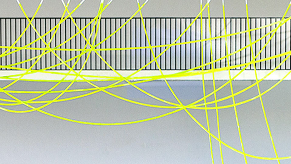
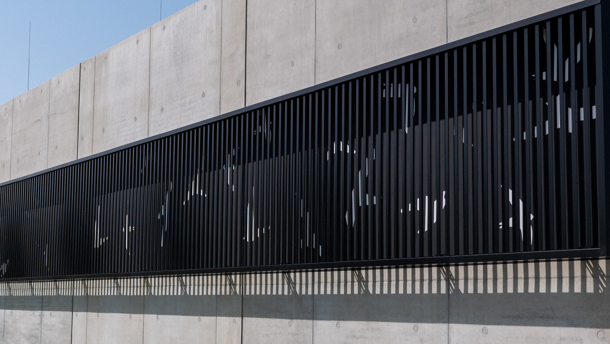
At the heart of our appearance lies an atypical, generative design: »LAB« stands for the experimental part of our work, whereas »BINÆR« represents the binary system, which is the basis for our modern brush, the computer.
A logo ought to be a brand’s visual anchor, which traditionally must always be consistent in order to ensure maximum recognition. At first glance, we seem to be tossing this basic rule over board, since our signet changes hourly, generating myriad variations. Yet within the inconsistency lies the consistency. Our logo therefore mirrors an ideal daily routine in which we redefine ourselves in order to carry out our projects.
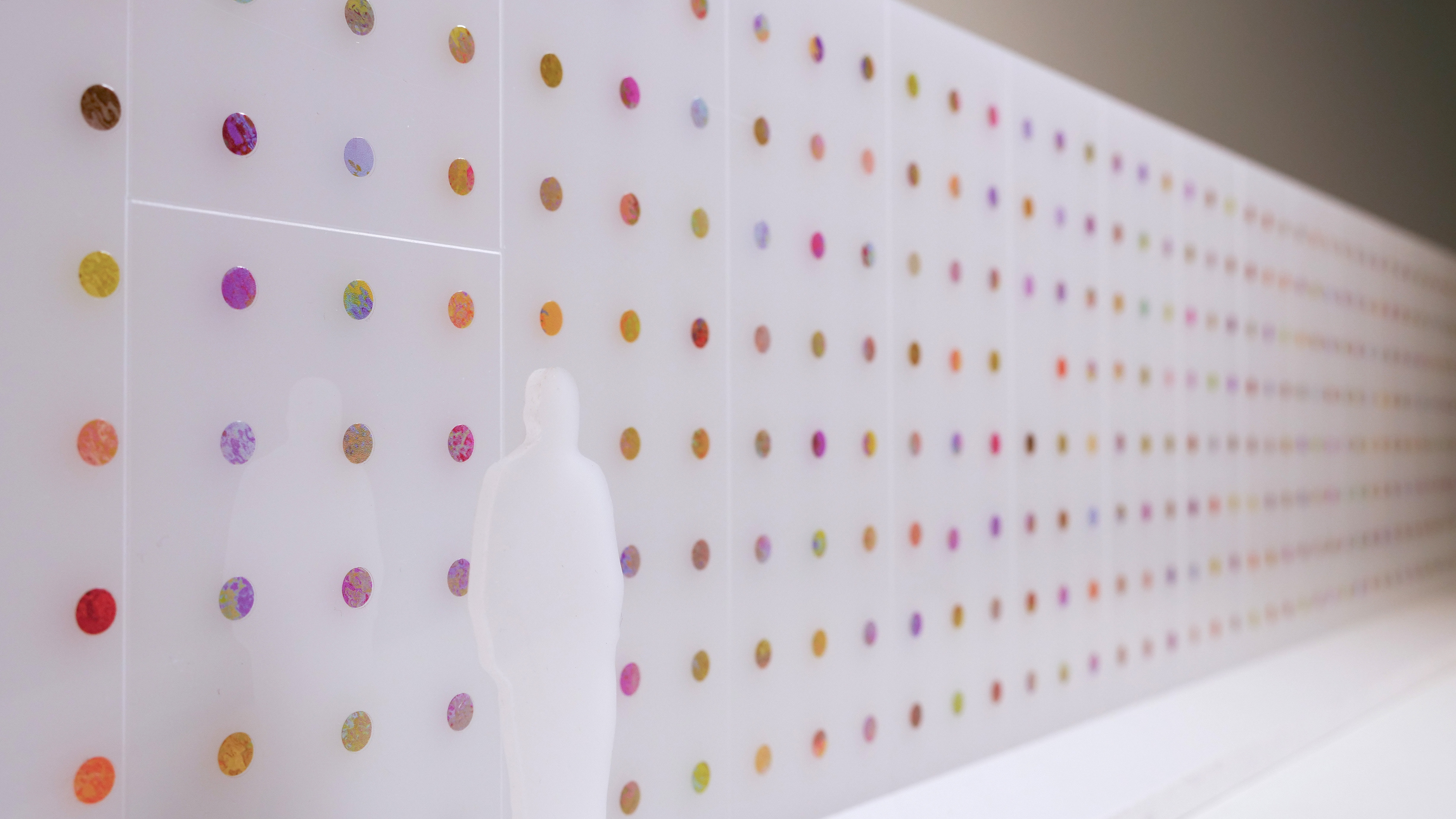
The variations are generated by software that analyses the tasks in our calendar on an hourly basis. These tasks may be for an unconventional experiment or for professional applications and the resulting knowledge. Each task, based on its category, generates a unique influence on the logo, either in the »LAB« or »BINÆR« section.
Displaying these influences on a time line results in a logo animation, which visualizes our atelier’s dynamics over time.
Developed with Ben Wegscheider
